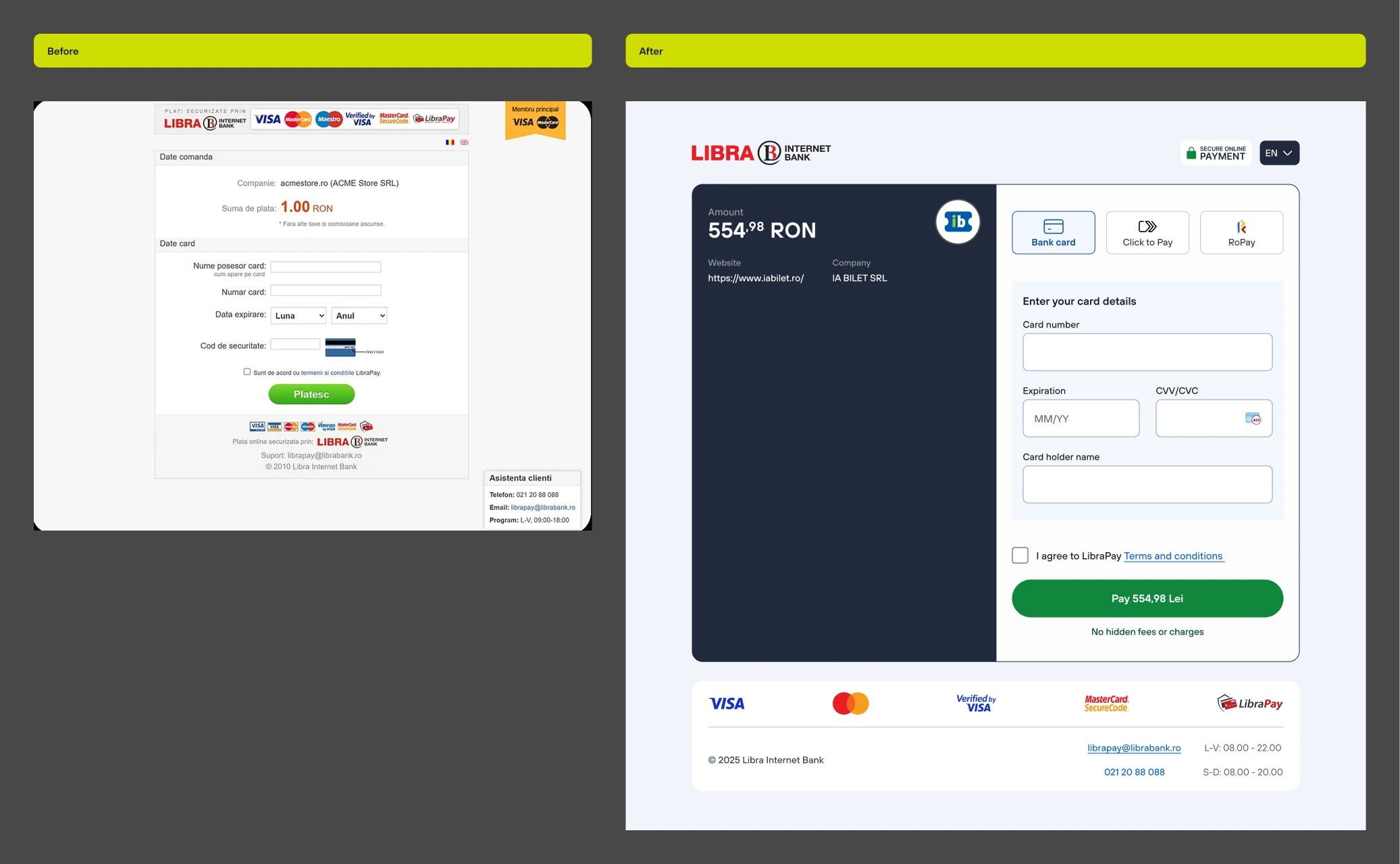
- Looked outdated
- Card only, no wallets, no faster way to pay
- Built for desktop, mobile just got squeezed to fit
- Errors handled poorly
LibraPay
Rebuilding the page every merchant's customer sees, right before they pay.
(1) Overview
(1.1) About LibraPay
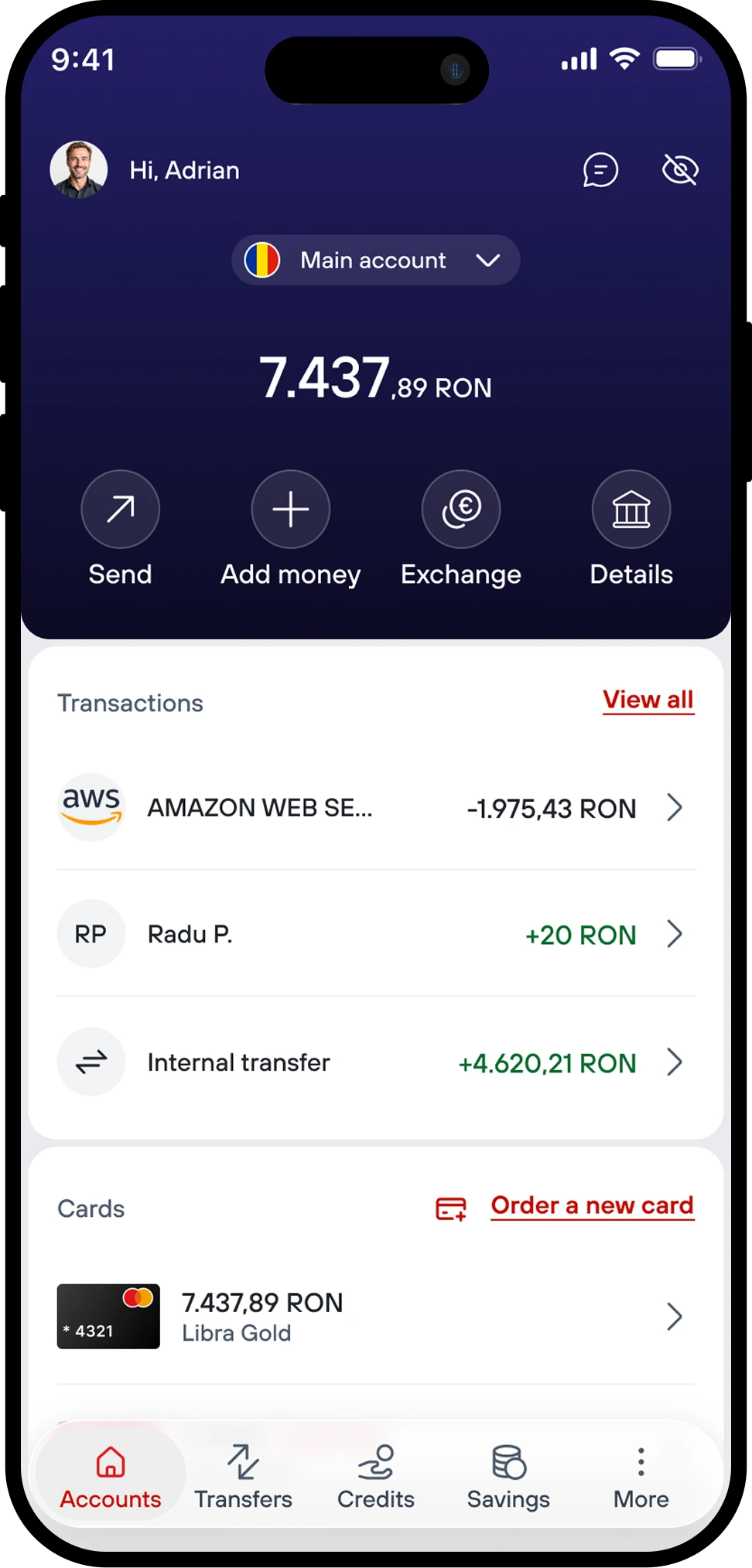
LibraPay is Libra's payment processing service. It's the page that loads when you buy tickets, order online, or pay any merchant that uses Libra as their payment provider. It's not the bank's app. It's the last screen between a customer and their money, for people who may never have heard of Libra at all.
The old page had two problems that fed each other. It looked like it hadn't been touched since the service launched: cluttered trust badges, a form crammed into a corner, a floating support widget that covered half the screen on smaller devices. And it did exactly one thing: take a card number. No wallets, no one-tap options, nothing that matched how people had started expecting to pay anywhere else online.
I worked on this alongside one other designer. We started in May 2024 and shipped, design and development together, about six months later.
(1.2) Problems at a glance
(1.3) Role
👤 Role
UX/UI Designer
🏦 Client
Libra Internet Bank
👥 Team
Scrum team
💻 Platform
Web, desktop & mobile
⏳ Timeline
May 2024 - Nov 2024
🟢 Status
Shipped
(2) Research
(2.1) Why a working page was
still losing people
Before redesigning anything, we needed to understand why a page that technically worked was still losing people. A few things came out clearly.
"I got to this page and genuinely wasn't sure if it was safe. It didn't look like it belonged to a real bank."
Customer quoteTrust came first
Trust was the first problem, before usability even mattered. People landing on the page from a merchant's checkout had no relationship with Libra, and the old design gave them no reason to believe the page was legitimate. Some assumed they'd been redirected somewhere wrong.
Mobile converted worse
Most payments happened on mobile, but mobile converted worse than desktop. The old page had never really been built for a small screen. It was a desktop form that got squeezed down, not designed down.
No card, please
People wanted to pay without touching a card at all. Apple Pay came up unprompted, repeatedly, as what people expected to see and didn't. A card number felt like a step backward compared to how they already paid for things elsewhere.
The baseline had moved
A competitive review of processors like Stripe made one thing obvious: wallets, saved cards, and a page that visually matched the brand behind it weren't premium features anymore. They were the expected minimum.
(2.2) What it changed
The brief stopped being "modernize the visual design" and became "give people a reason to trust this page, on the device they're actually using, with the payment method they already prefer." Three different problems, not one.
(2.3) The problem
The old LibraPay page asked people to hand over their card details on a screen that didn't look like it belonged to anyone in particular, let alone a bank. It offered one way to pay, on a layout that treated mobile as an afterthought, at the exact moment in a purchase where hesitation is most expensive, both for the merchant losing the sale and for the bank processing it.
(3) New payment methods
(3.1) What people kept asking
for
Three methods went in alongside the redesign, all in direct response to what people kept asking for.
Apple Pay
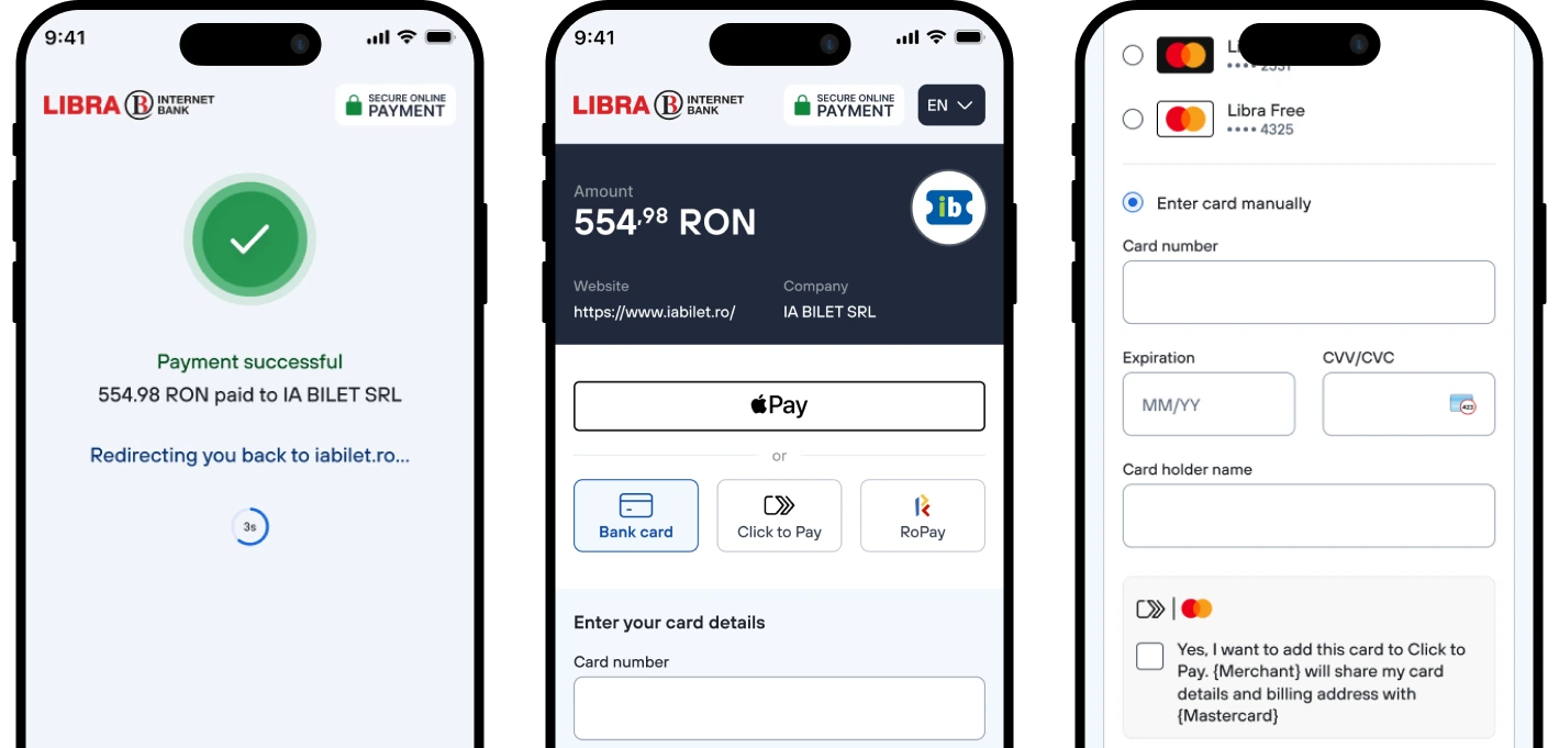
The single most requested option in every research session. Added early, and treated as a first-class method, not a secondary link, on any device where it's actually available.
Click to Pay
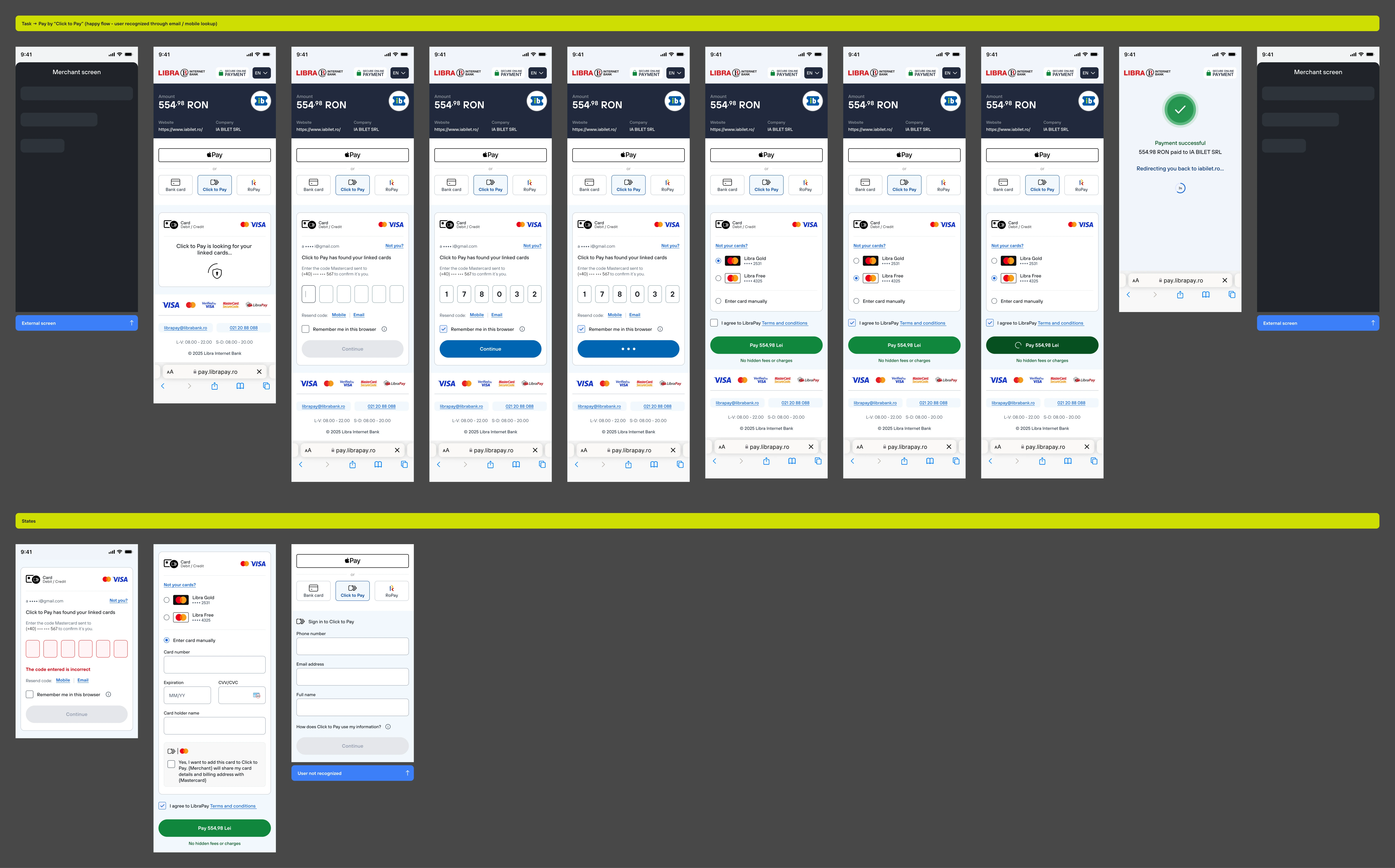
Recognizes a returning customer by email or phone, and pulls up their saved cards from the network directly. It's Visa and Mastercard's own version of a saved-card wallet, so people aren't tied to having used LibraPay specifically before.
RoPay
Romania's instant payment scheme, added for people who'd rather pay directly from their bank account than reach for a card at all.
All three were fast-tracked once we saw how consistently people asked for a way to pay that didn't involve typing card digits.
(4) The solution
(4.1) Trust first, then the
form
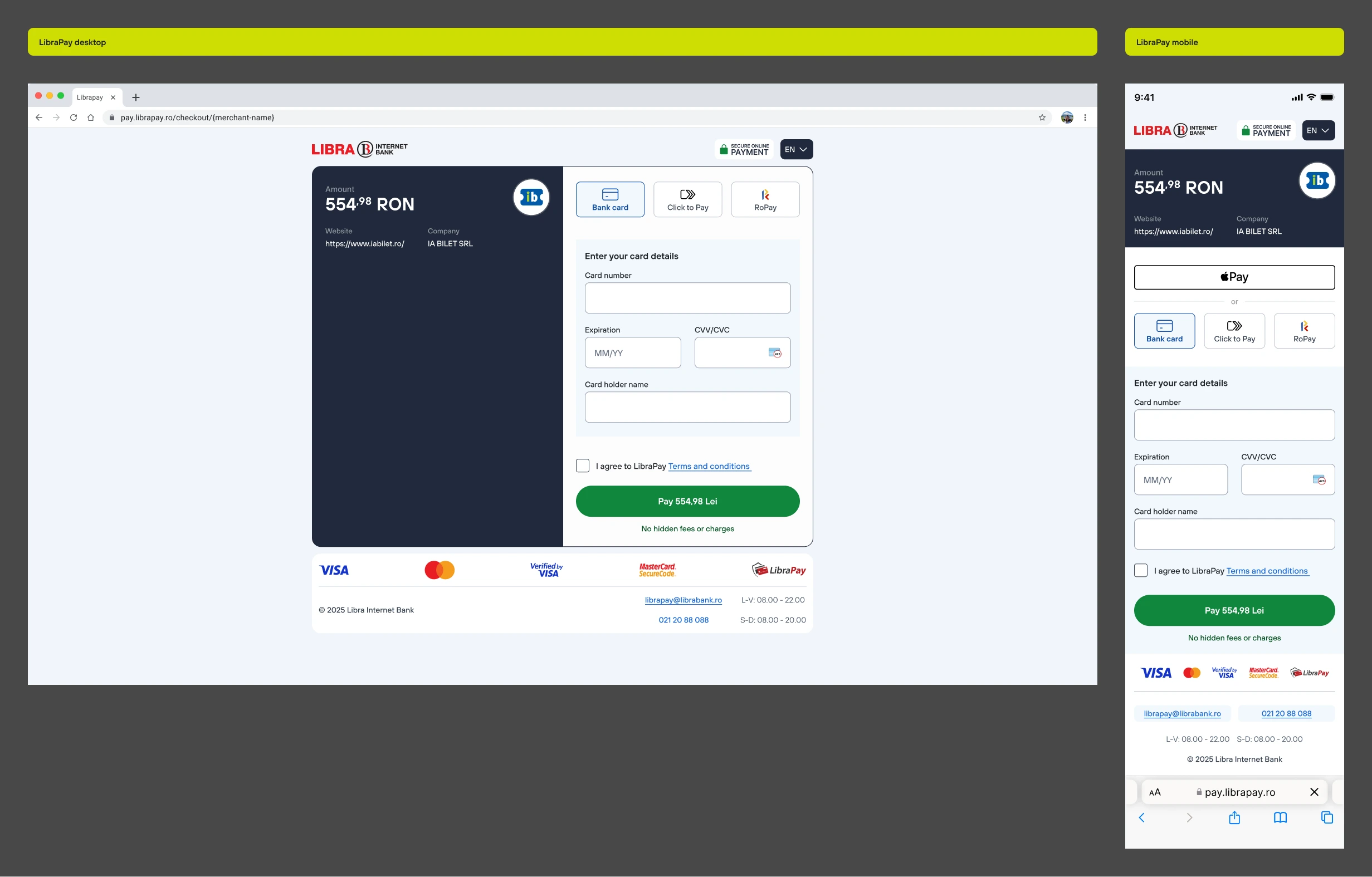
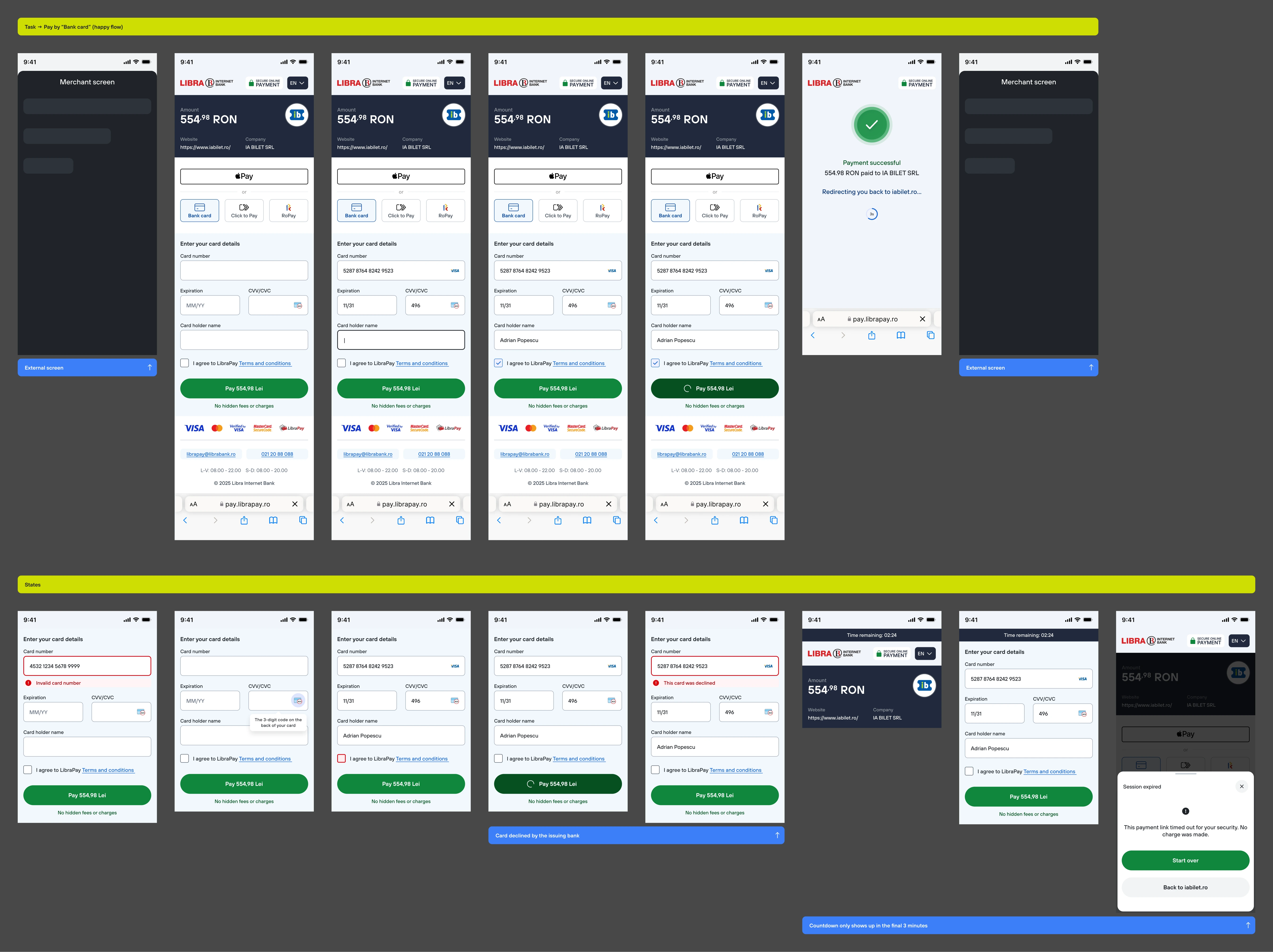
The new page leads with the bank's identity, clearly, before it asks for anything. Amount and merchant sit in a fixed panel that never moves, so no matter which payment method someone picks, they can always see what they're paying and to whom. The three methods sit as equal tabs, not a form with links to alternatives buried underneath.
Mobile got its own layout, not a compressed version of desktop: the trust panel and the form stack vertically, with Apple Pay surfaced immediately when the device supports it.
(5) How we tested it
(5.1) Internal usability
testing
This page belongs to merchants, not to Libra's own customers, which made external usability testing harder to arrange than it would be for the bank's app. Instead, most of our testing happened internally, with bank employees who hadn't seen the designs, walking through Figma prototypes on both desktop and mobile.
It wasn't a substitute for testing with real cardholders, but it caught a lot: confusing states, unclear error messages, moments where people hesitated over which method to pick. We iterated through several rounds of prototypes before the flows felt obvious enough to hand to engineering.
(6) Results
(6.1) After launch
Mobile conversion overtook desktop
For the first time since the page existed, more payments completed successfully on mobile than on desktop, a full reversal of the pattern research had flagged going in.
Apple Pay became a default habit fast
On devices where it was available, it quickly became the most-used way to pay, ahead of typing in a card.
Fewer "is this safe" moments
Support and merchant feedback stopped mentioning trust or legitimacy concerns about the page, a recurring theme before the redesign.
(6.2) In hindsight
Internal usability testing is not the same as watching real cardholders under real purchase pressure. If I did this again, I'd push harder, earlier, for a way to test with actual merchant customers, even a small panel, before shipping.
Next project
↴
Libra Internet Bank
Redesigned from day one for 123k+ active users. App Store rating up from 4.2 to 4.5, fewer support tickets, more transactions completed.