- Too transactional
- Hard to discover
- Support tickets for things the app already did
- Design dev gap
- No design system, slower to ship
- Design seen as decoration, not strategy
Libra Internet Bank
Redesigning the mobile banking app for 123k+ active users.
(1) Overview
(1.1) About Libra
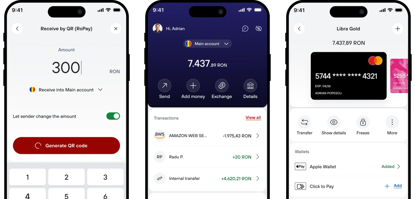
Libra serves individuals and business owners on the same app. I redesigned both sides end to end, while the engineering team rebuilt it in React Native. This case study focuses on the personal banking flows.
(1.2) Problems at a glance
(1.3) Role
👤 Role
UX/UI Designer
🤝 Contribution
End-to-end product redesign
👥 Team
Scrum team
💻 Platform
React Native — iOS & Android
⏳ Timeline
2026 - ongoing
(2) How we found the friction points
Marketing had analytics: time on page, completion time per flow. Useful, but it only told me what was happening, not why. I needed direct feedback, so I pulled from a few sources:
- Feedback that came in through email and support
- The support ticket backlog
- Weekly reports from the call centre on what customers were struggling with
- Where people actually dropped off in the app
I ran all of it through AI to sort by root cause, spot patterns, and turn it into a clear, short list of actual problems.
(3) Homepage (accounts overview)
(3.1) Total Balance vs. Spending
Power
The old home screen answered "how much do I have in total?". People were opening it to actually do something, and mostly from the same account.
(3.2) Research
2.4
accounts per customer,
median
62%
of sessions ended in an
action, not
just a balance check
31
tickets in 1 month about
having to pick the same account every time
Top 3 actions
Pay, check balance, check
details on the last transaction
7%
of customers holding 5+
accounts
"I have one account I actually use. I shouldn't have to select it every time I open the app."
Customer quote(3.3) The problem
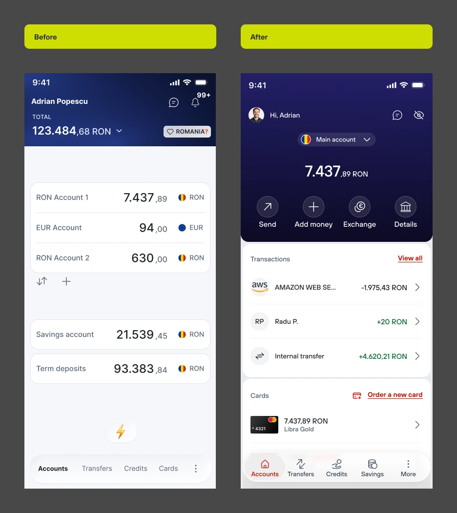
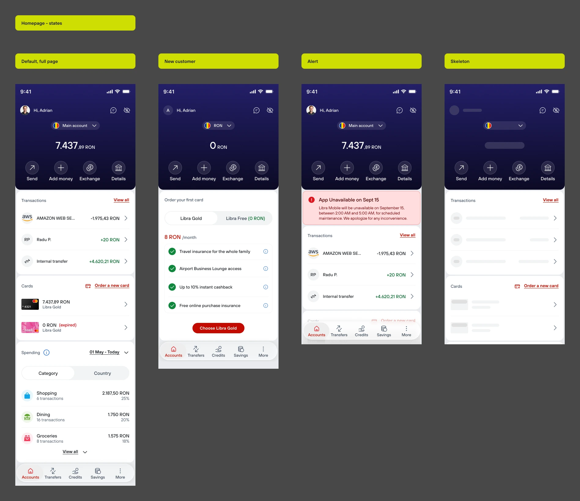
The old home screen tried to show everything at once: every account, every deposit, a grand total up top. Except 93% of users have four accounts or fewer, and almost nobody opens the app just to stare at a number. We were designing for 7% of users on the one screen literally everyone sees first.
(3.4) The solution
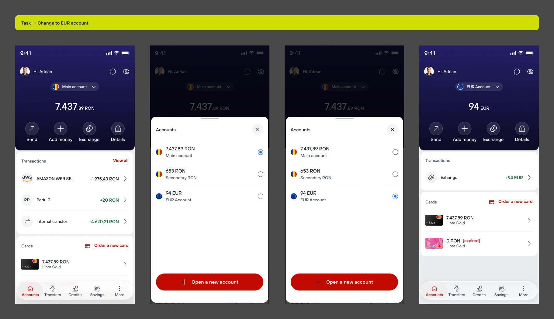
Show one account at a time, put four actions above the fold, and make switching accounts one tap away. The account list didn't go anywhere: it just moved to where switching actually happens.
(3.5) The results
4.2 → 4.5
App Store rating, 4 months
post-release
87% of users
reached payment without
picking an account first
0 taps
to see your last transaction
(already there)
31% of new users
ordered a card within their
first 72 hours
(3.6) Constraint
Constraint
Business customers really do juggle 3 to 4 accounts a day. Killing the list would've fixed the homepage for most people but broken it for them.
Decision
Keep one account in focus, move the switcher into a bottom sheet. Same one tap cost as before, but it's not competing for space on the main screen anymore.
Trade off
You can't glance at every balance at once anymore. A few customers mentioned missing that. I kept the change anyway: the total was mostly a vanity number for most users, and the switcher still shows every balance if you need it.
(4) Add money
(4.1) Research
66%
abandoned the flow at manual
card entry
2
top-ups per active user per
month, same card almost every time
CVV
Most common entry
error
45s
Median card entry time, first
attempt
"Why isn't my card saved? Typing 16 digits every time I add money is exhausting."
Customer quote(4.2) The problem
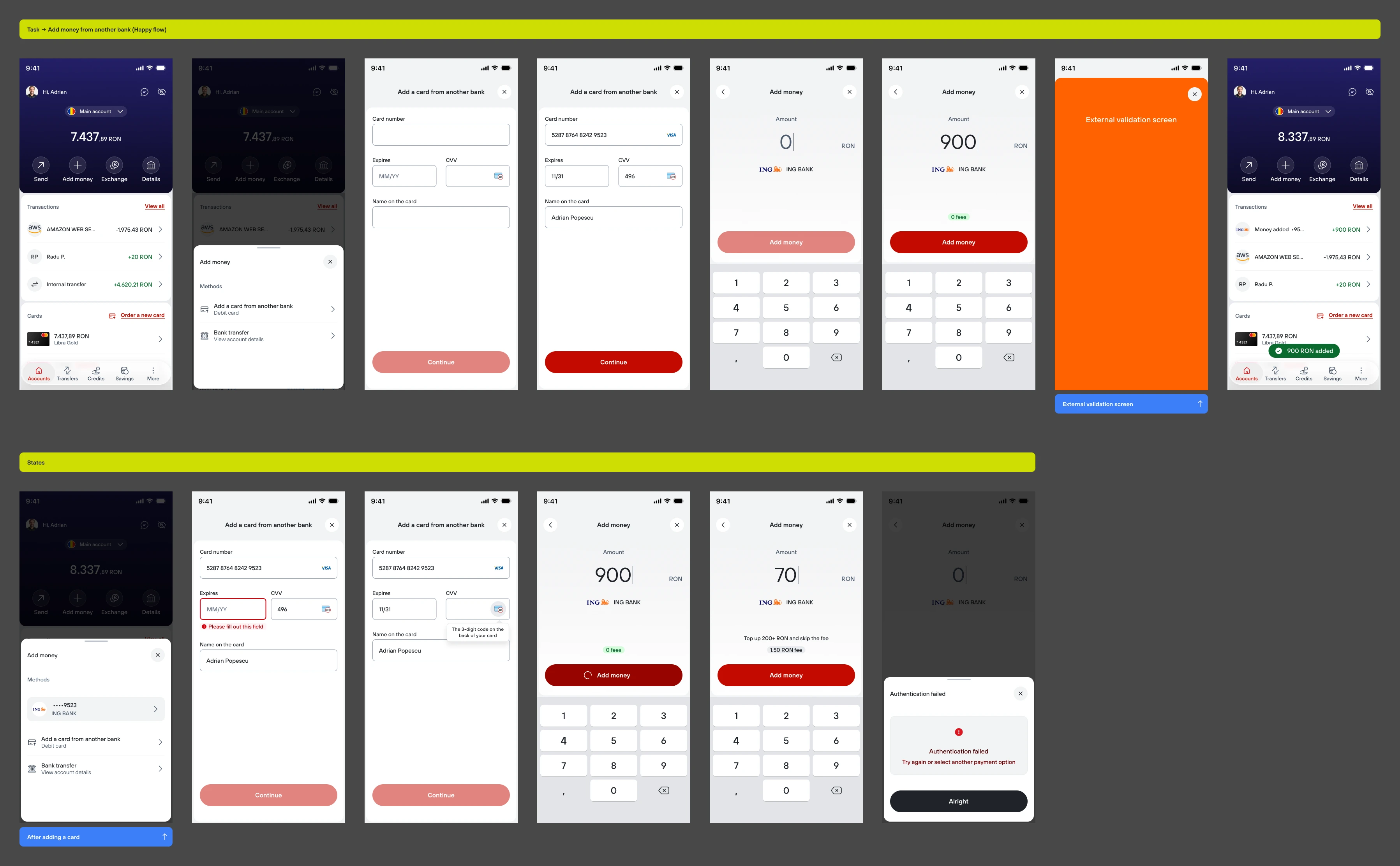
Every top up started from zero, even for someone using the exact same card for the tenth time that month. And when finance needed to add a fee, there was no natural place to put it in a flow that never talked about cost at all. Some people didn't even know what a CVV was.
(4.3) The solution
Saved cards, so the common case is almost free of friction. A fee that explains itself: the "how to avoid this" message sits above the amount, so you see the way out before the cost. And a CVV icon and tooltip, so nobody has to guess.
(4.4) The results
1 tap
to add money with a saved
card
2 → 3
top-ups per active user per
month
only 4
users in 1 month abandoned at
the CVV field
(5) Cards
(5.1) Research
24%
completion rate on the old
card ordering flow
3 min 20s
median time to order a card,
7 screens
18%
of new cardholders added
their card to Apple Wallet in the first month
"I had no idea I could add my card to Apple Wallet in the app."
Customer quote(5.2) The problem
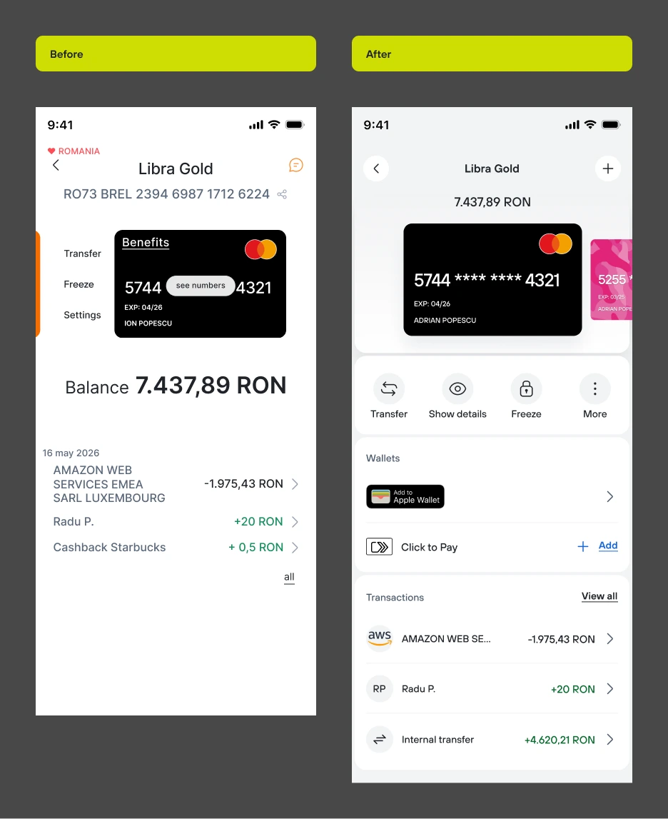
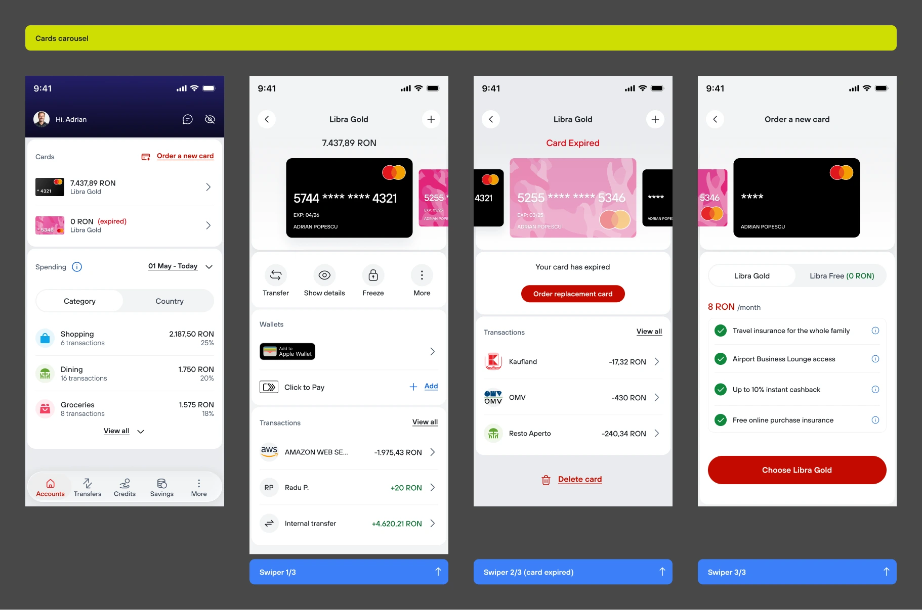
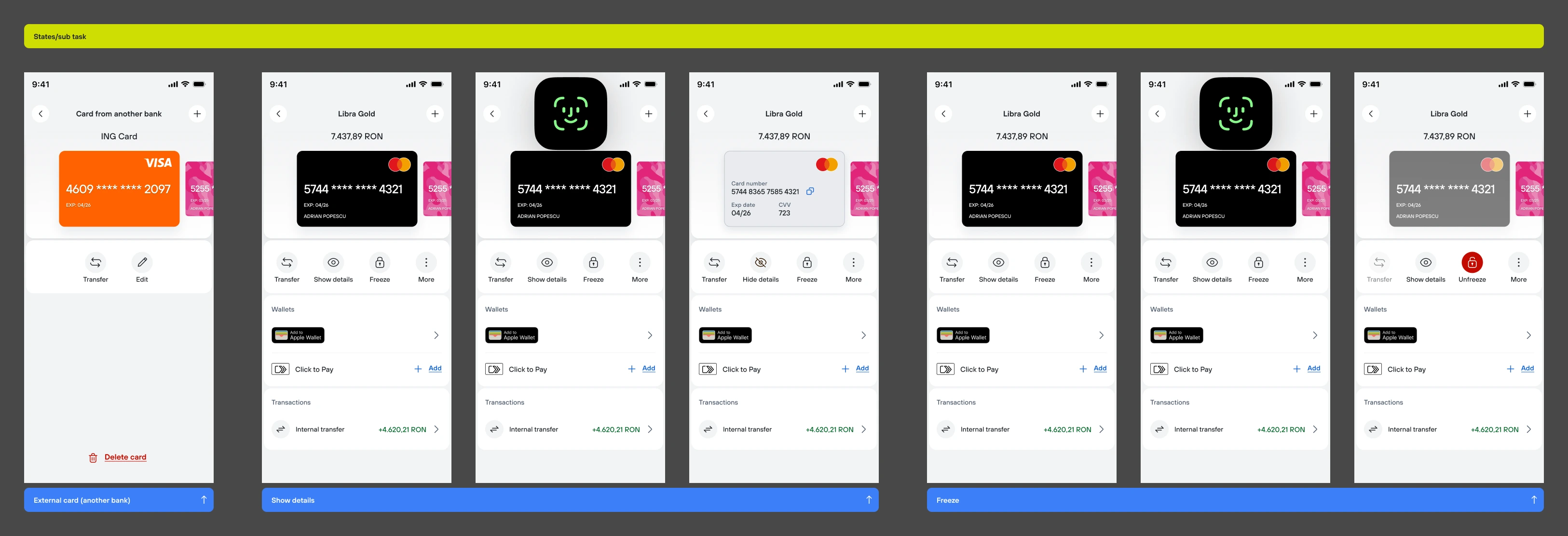
The old card screen had a real hierarchy problem. Basic stuff like Freeze card or See details was buried, while big features like Apple Wallet integration were almost invisible. If someone can't find a feature in a few seconds, it might as well not exist.
(5.3) The solution
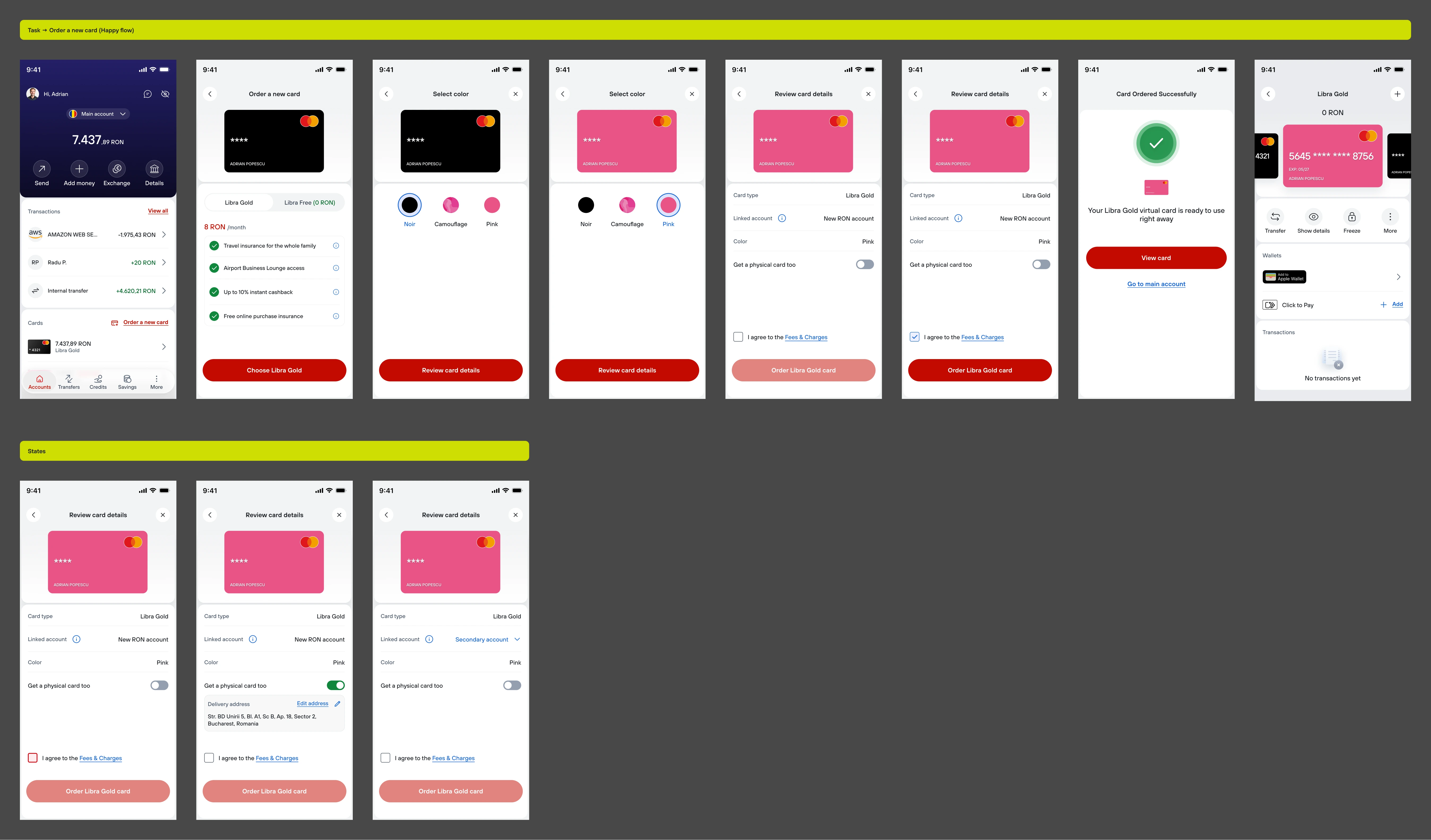
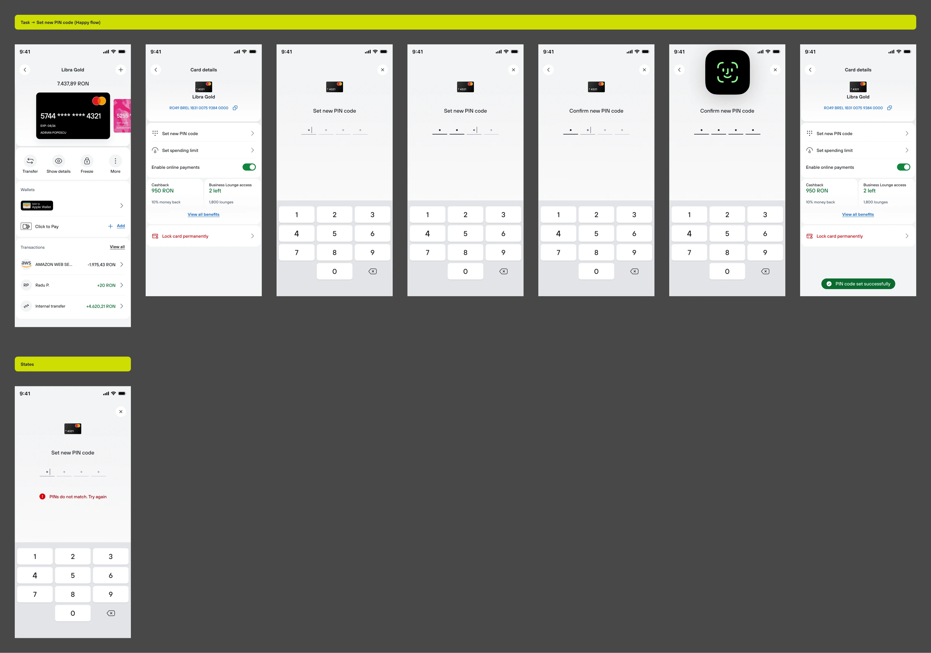
Four actions above the fold: Transfer, Show details, Freeze, More. Ordering a card is now just picking a colour and reviewing, everything else is prefilled and editable. And the virtual card works the moment it's issued.
(5.4) The results
7 → 4
screens to order a
card
3:20 → 1:25 mins
median time to order a
card
24% → 37%
completion rate on card
ordering
0 taps
to locate "Add to Apple
Wallet"
(5.5) Where I got it wrong first
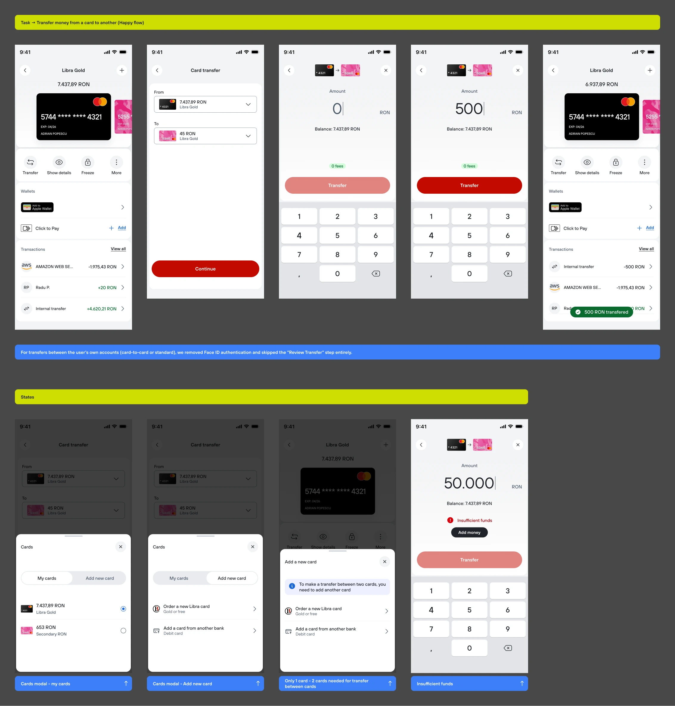
My first version of card to card transfers kept the Face ID step and a confirmation screen, just like external transfers. In testing, people thought it was ridiculous: it's your own money moving between your own cards, and the confirmation screen was just repeating what was already on screen. I dropped both steps, but only for transfers between your own cards. External transfers still keep every step.
(6) Transfers & payments
(6.1) Research
72%
of transfers went to a
beneficiary the customer had already paid that quarter
1min 40s
median time for a RON
payment
12%
of users started a payment
from the wrong account
"Every payment starts from zero. Even the ones I make every single week."
Customer quote(6.2) The problem
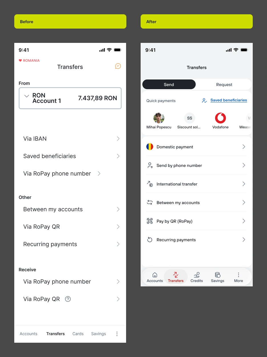
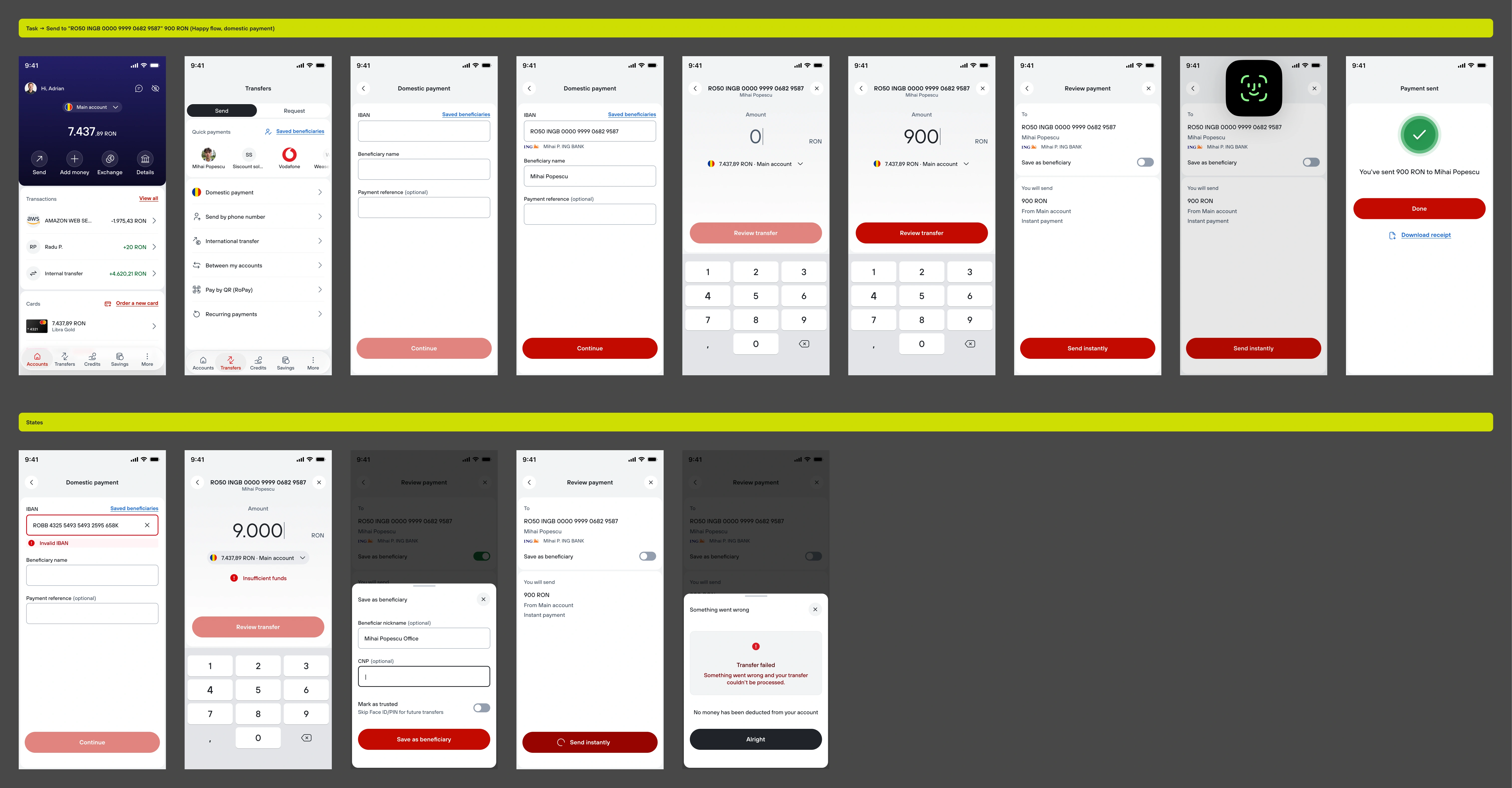
The app did nothing to make repeat payments easier. It never suggested people you'd paid before, so every transfer started from scratch. On top of that, the domestic payment screen asked for everything at once, who you're paying, how much, from which account, all on a single page. It made for a long screen that took more effort to process than it should have.
(6.3) The solution
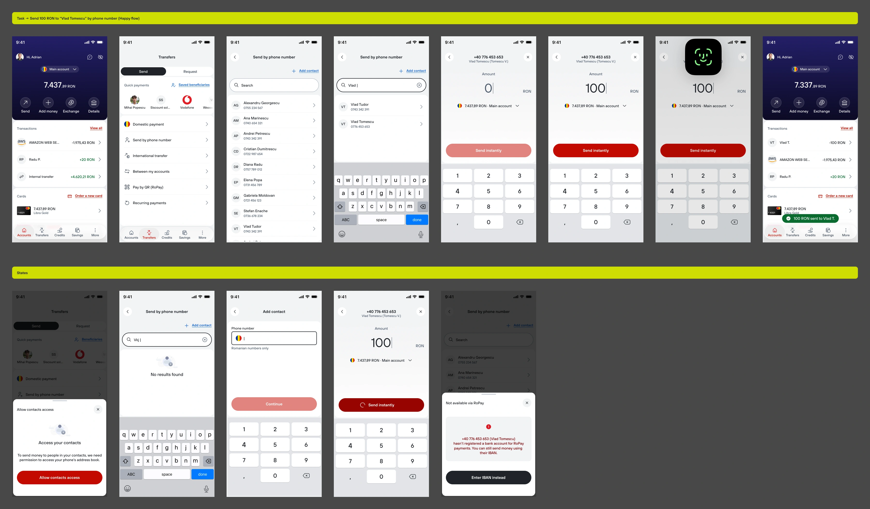
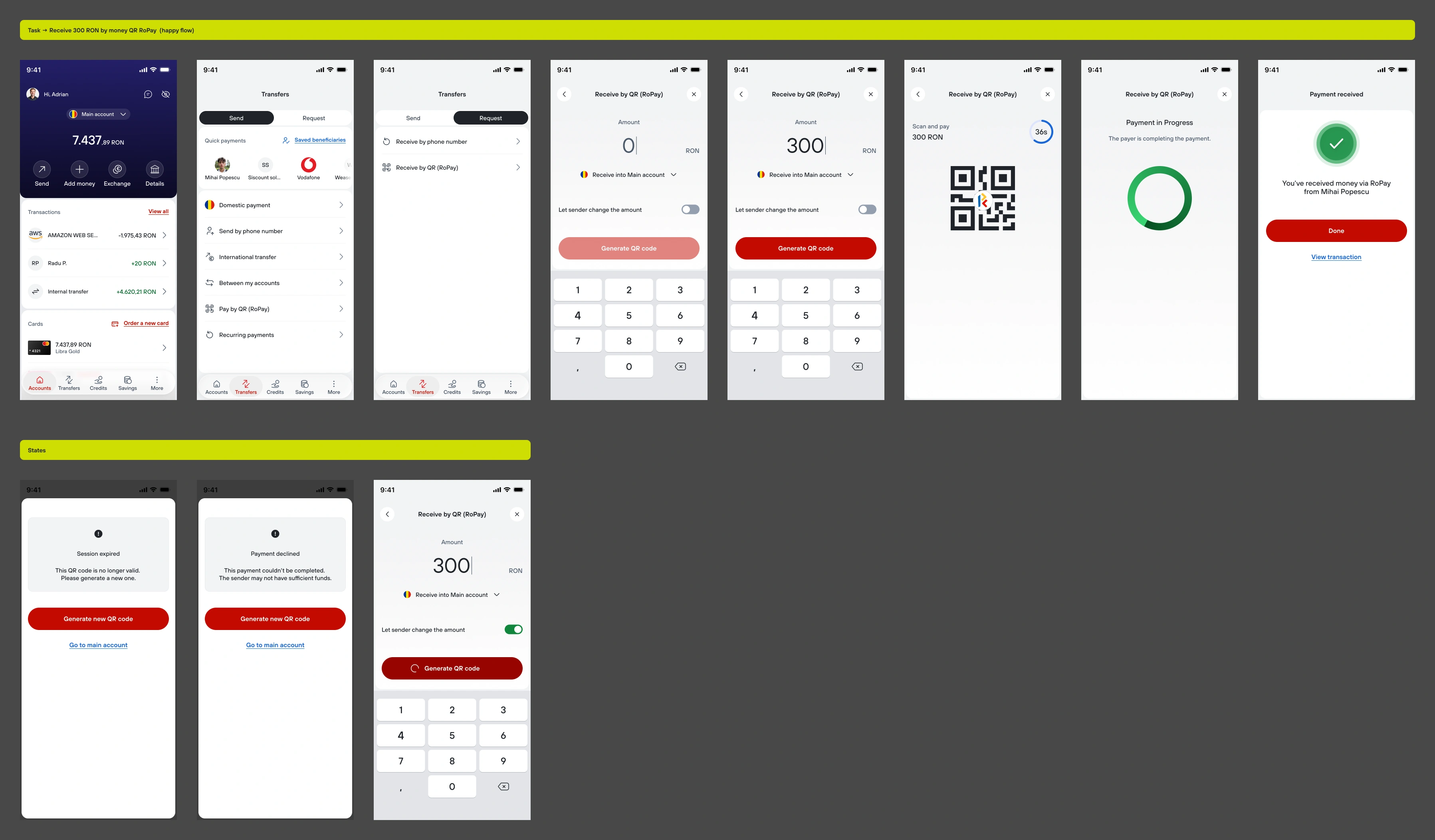
Frequent payments got their own row at the top. New payments still use the full form, split into separate screens for who, how much, and which account, with validation at the field instead of at the end. Sending and receiving also split into their own screens.

(6.4) The results
1:40 → 1:05
median time for a RON
payment
41%
of transfers now start from
the quick payments row
9% → 2%
IBAN validation failures
reaching submit
1 tap away
to pay a frequent
beneficiary
(6.5) Debate: recipient first or
amount first?
Research showed people split into two camps: some want to pick the recipient first to avoid mistakes, others want to type the amount first because that's the number already in their head. Both make sense, this is still an open question I'm testing.
(7) The design system
When I joined Libra there was no Figma and no design system. Screens went to developers as HTML&CSS files.
The developers loved it: not because it looked nice, but because for the first time they could read a component file that felt like it was written for them. No more measuring screenshots. The rest of the bank loved it too: suddenly everyone could see what was being built, share screens with clients, and actually point at something when they needed to convince someone.
2 designers
covering the whole
product
WCAG AA
contrast checked on every
text style; errors never rely on color alone
MCP
once the system was stable,
an AI assistant could read components straight from Figma

(8) Closing thought
If there's one thing this project confirmed, again and again, it's that banking language and human language are not the same thing, and the gap between them is where people get lost. Regulations exist for good reasons. But a rule that has to be followed doesn't have to be written the way a bank talks to itself internally. It can be written the way you'd explain it to someone at a kitchen table.
Every screen in this redesign was, in some way, a small argument for that idea: that clarity isn't the opposite of rigor, it's what rigor looks like when it actually reaches the person it was meant for. The bank didn't lose anything by being direct. If anything, every time we removed a confusing word or a hidden step, trust went up, not down.
Next project
↴
Marketplace Auto
A car marketplace focused on search and filtering, helping people narrow down thousands of listings to the few cars actually worth a closer look.